Pedals to the metal.
Client: Tranter Motorsports
Identity Design
Tranter Motorsports is a team of drivers who compete on-track and online. When they reached out about a brand identity, we dropped rubber to build a clean, powerful visual presence.
All gas AND all brakes.
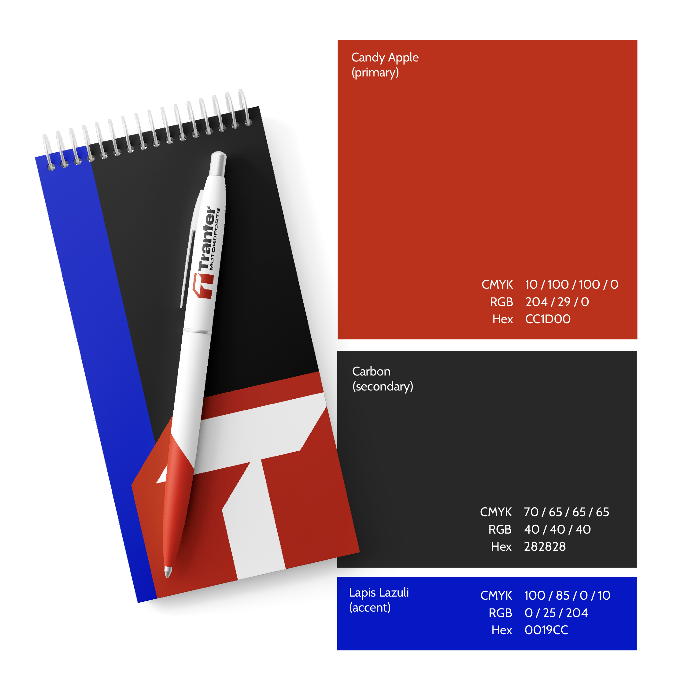
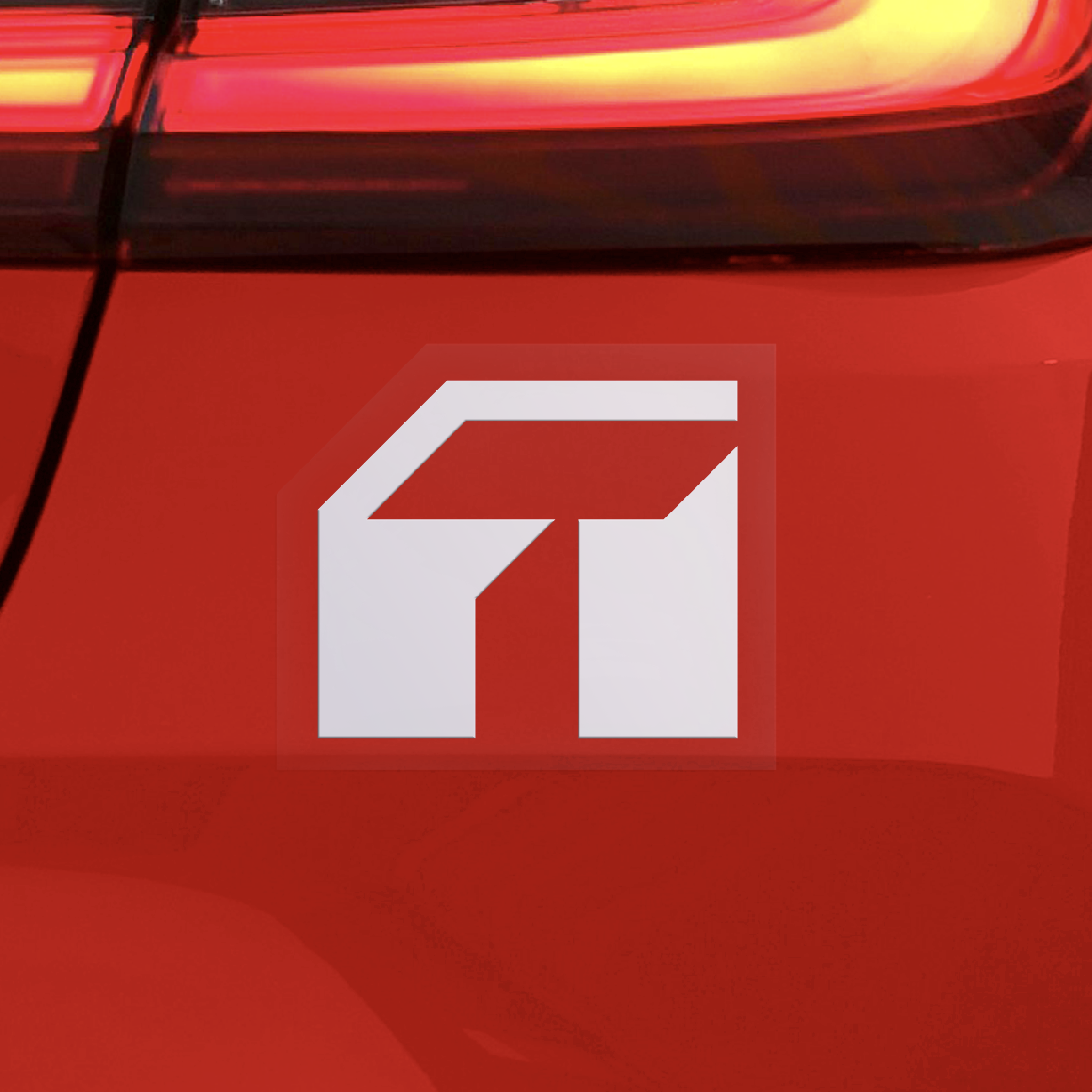
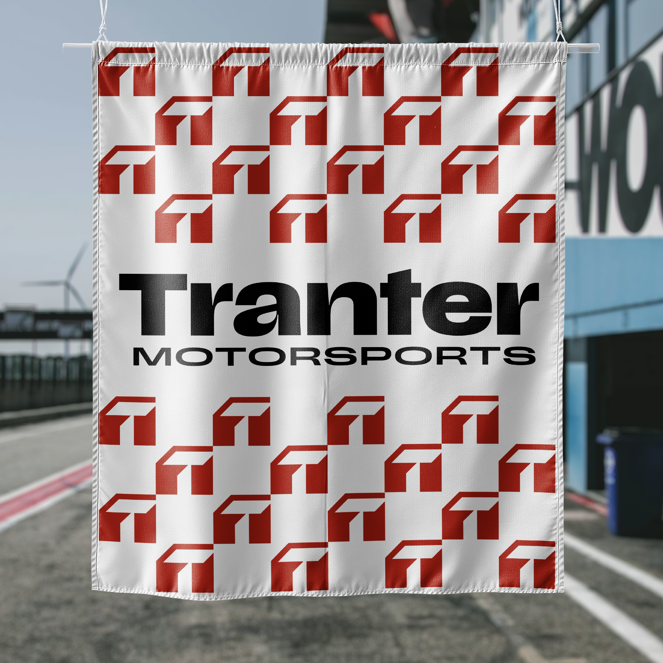
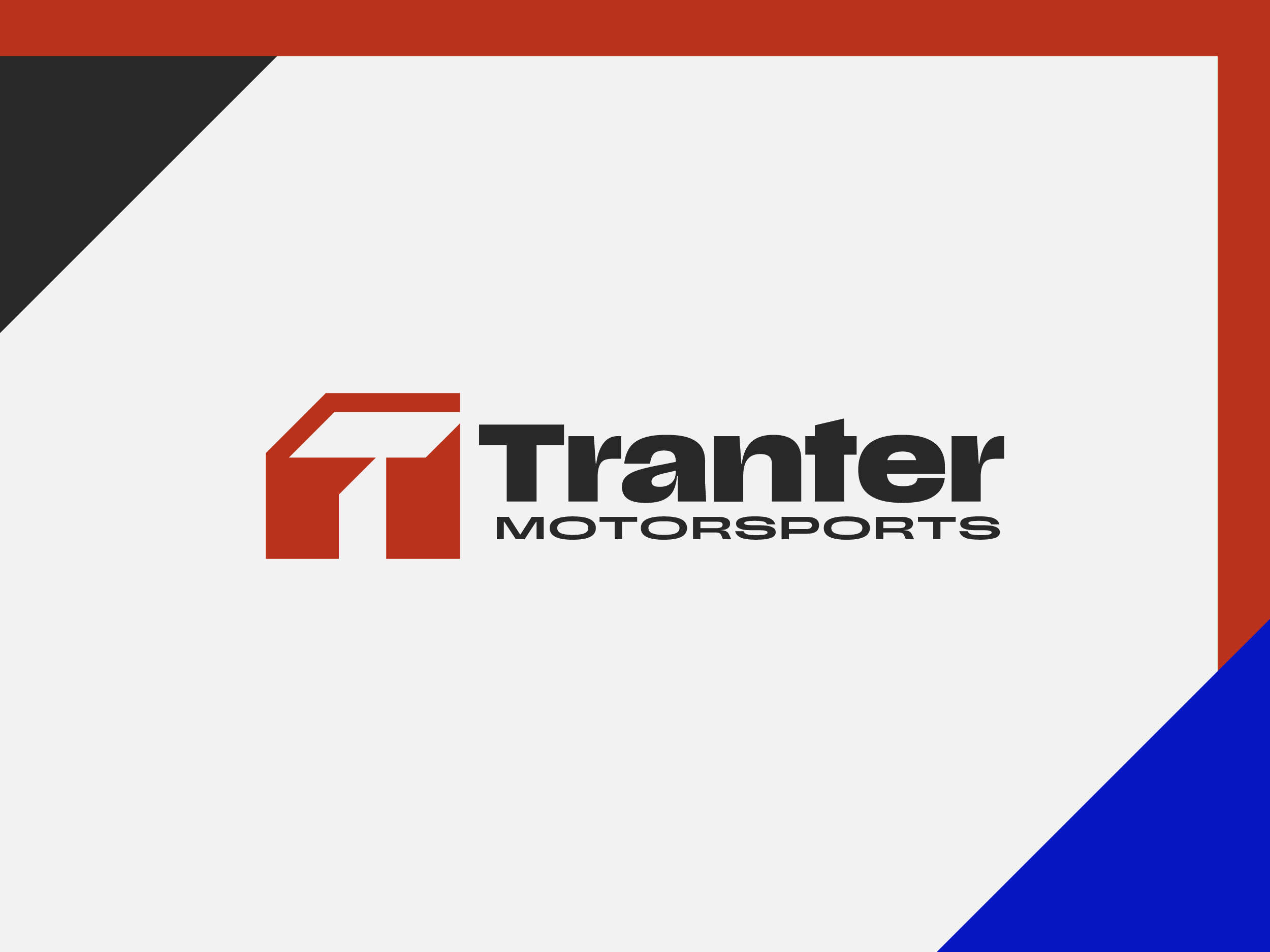
An aggressive T leaves an abstracted brake pedal and gas pedal in its tracks. Candy apple red is grounded by a deep rubber grey and complemented with a classic lapis lazuli. Scale, a beautiful variable font, communicates boldly and loudly: there’s no muffler on this brand.