
See the logo that managed to unify the RVA subreddit.
Client: City of Richmond, Virginia
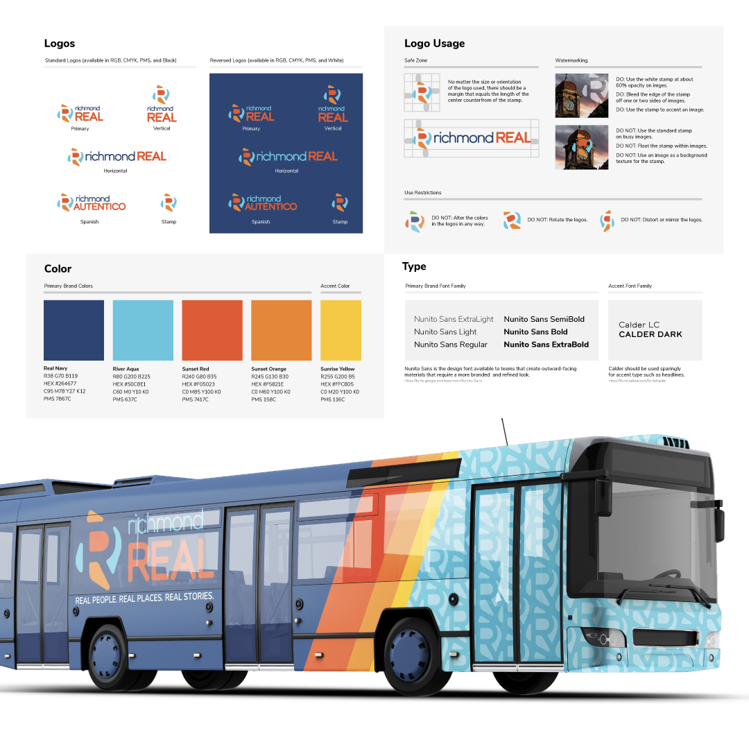
Identity Design
Graphic Design
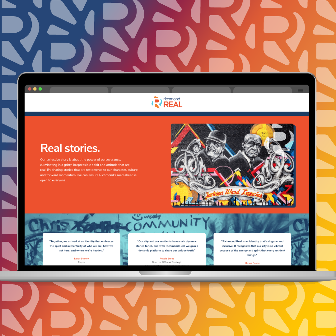
Web Design
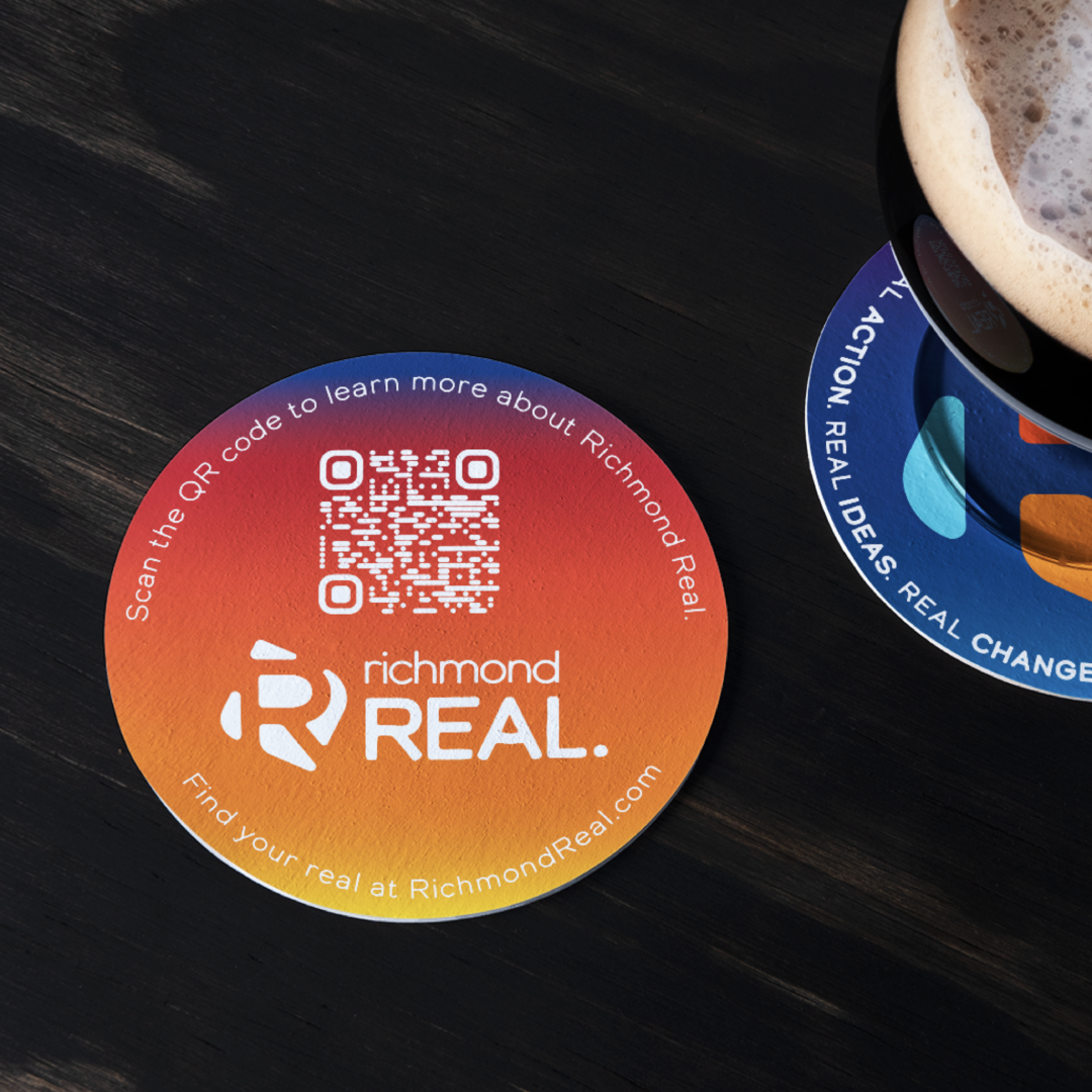
Print Design
Environmental Design
After months of community collaboration sessions with city leaders and citizens, Richmond Real was created as a rallying cry for the city to recognize its dark past while moving toward a brighter, more equitable future.
Even though the angry mob on reddit hated it, my mom said she really liked it.

A design which embodies the heart of the River City.
With a vibrant, soulful color palette, the logo is built around an "R" to show structure and strength, motion and passion, and authenticity and grit.
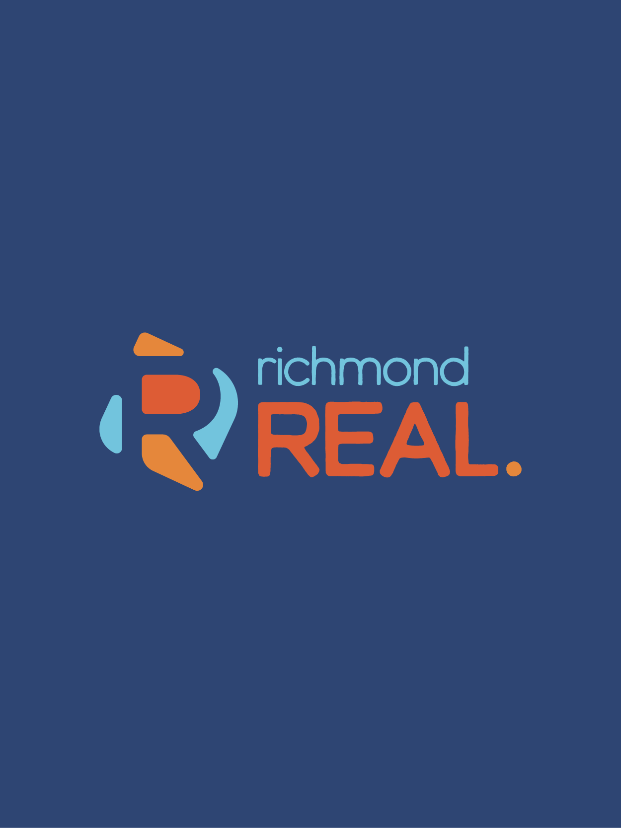

Structure
Thoughtful geometry suggests roadways, roundabouts, and bridges. The logo, like the city, is open and accessible from every direction.

Negative Space
Each piece of the logo relies on the others to form an R in the negative space, allowing the whole to shine above the sum of its parts.

Form
Organic, flowing forms reflect the physical reality of our natural landscape and storied city — from the river rocks of Belle Isle and Brown’s Island to the cobblestones of Shockoe Bottom and Jackson Ward.

Color
Vibrant, balanced colors nod to our unforgettable sunrises and sunsets, while highlighting the passion and soul of all Richmonders.


The logo lives on with the Richmond Economic Development Authority, who adopted the brand identity as their own.
Shouts out to Melodie Tutwiler and André Johnson for the creative direction.