
Rolling out a hot, new menu item.
Client: Potbelly
Campaign Development
Art Direction
Graphic Design
Brand Strategy
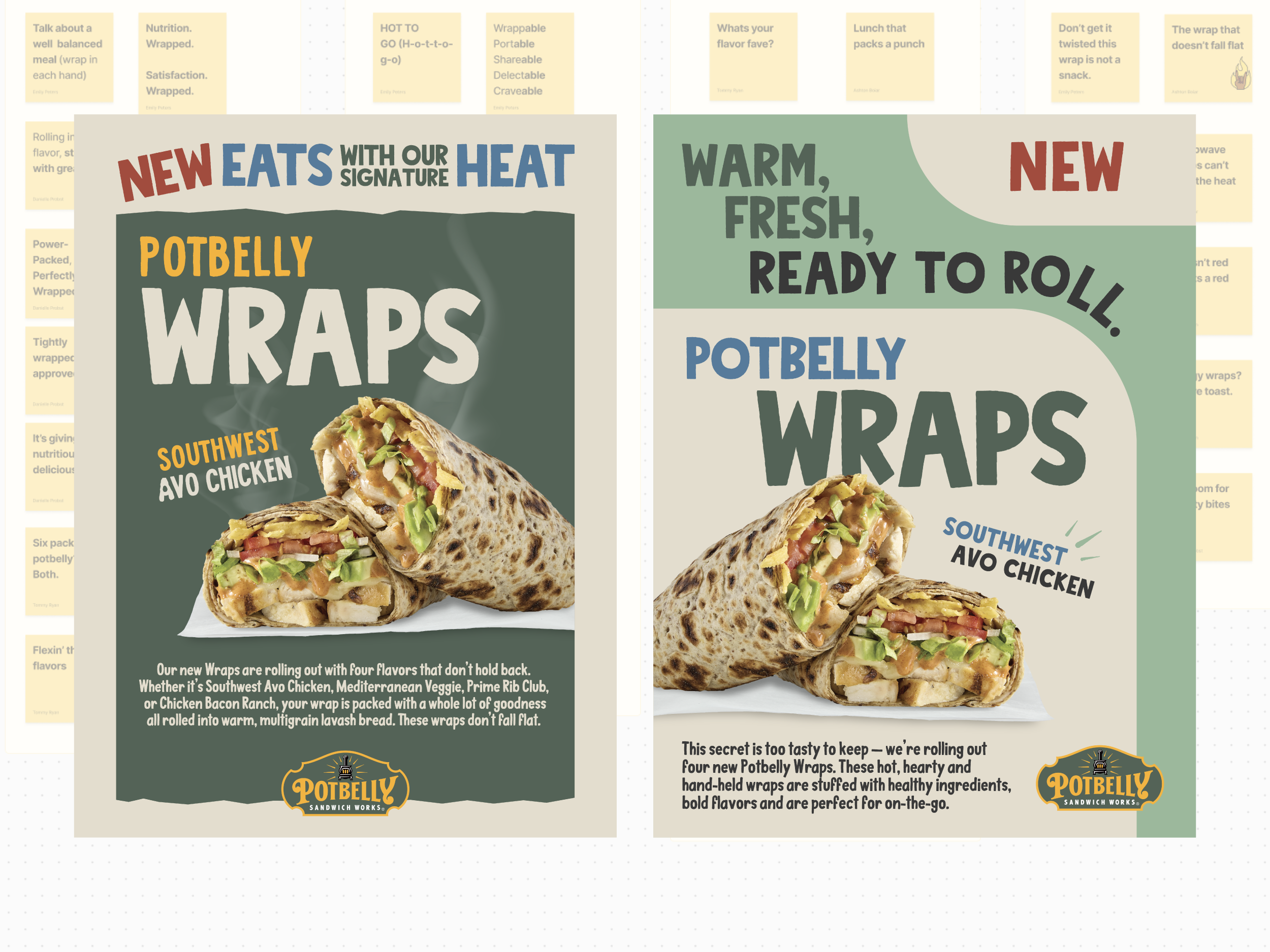
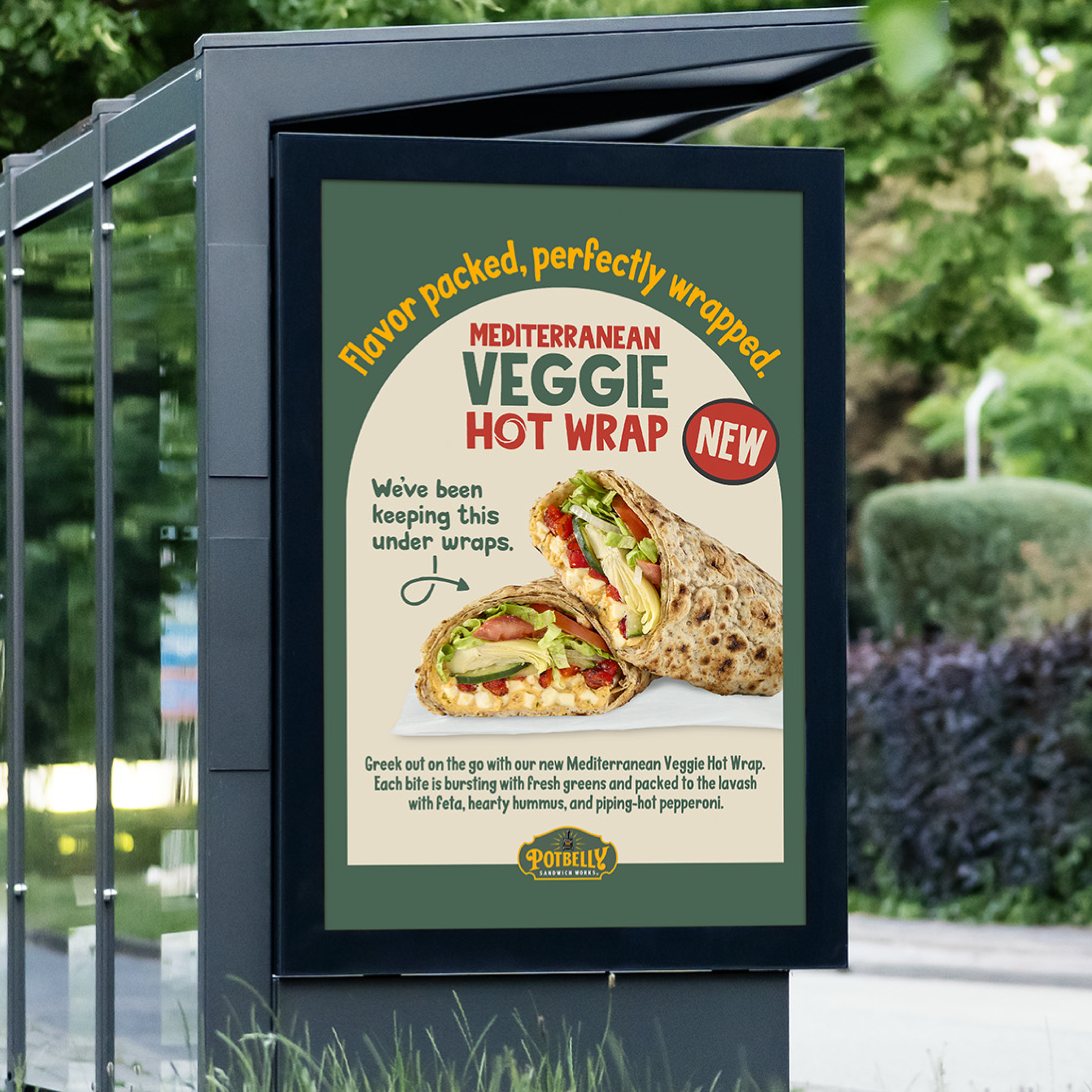
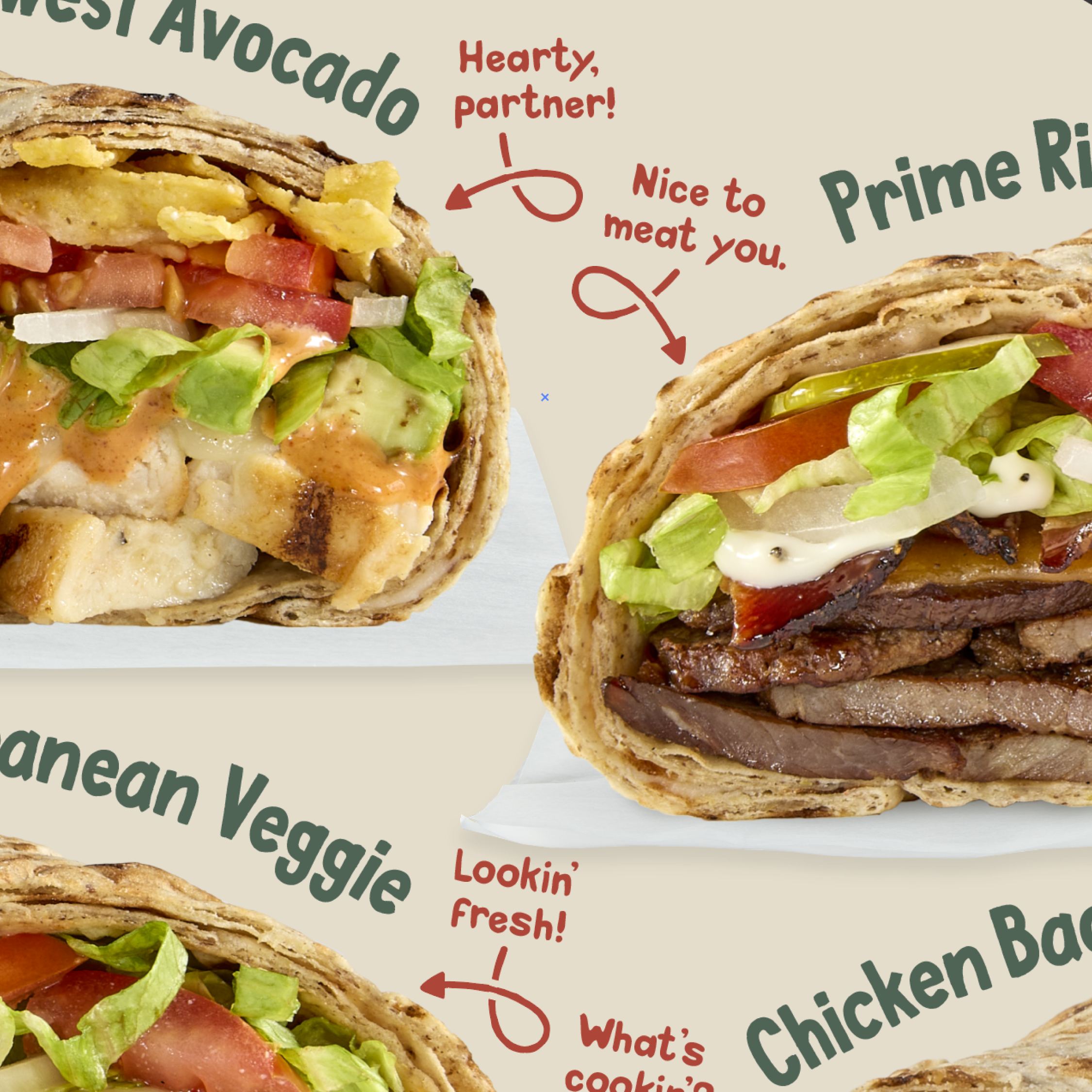
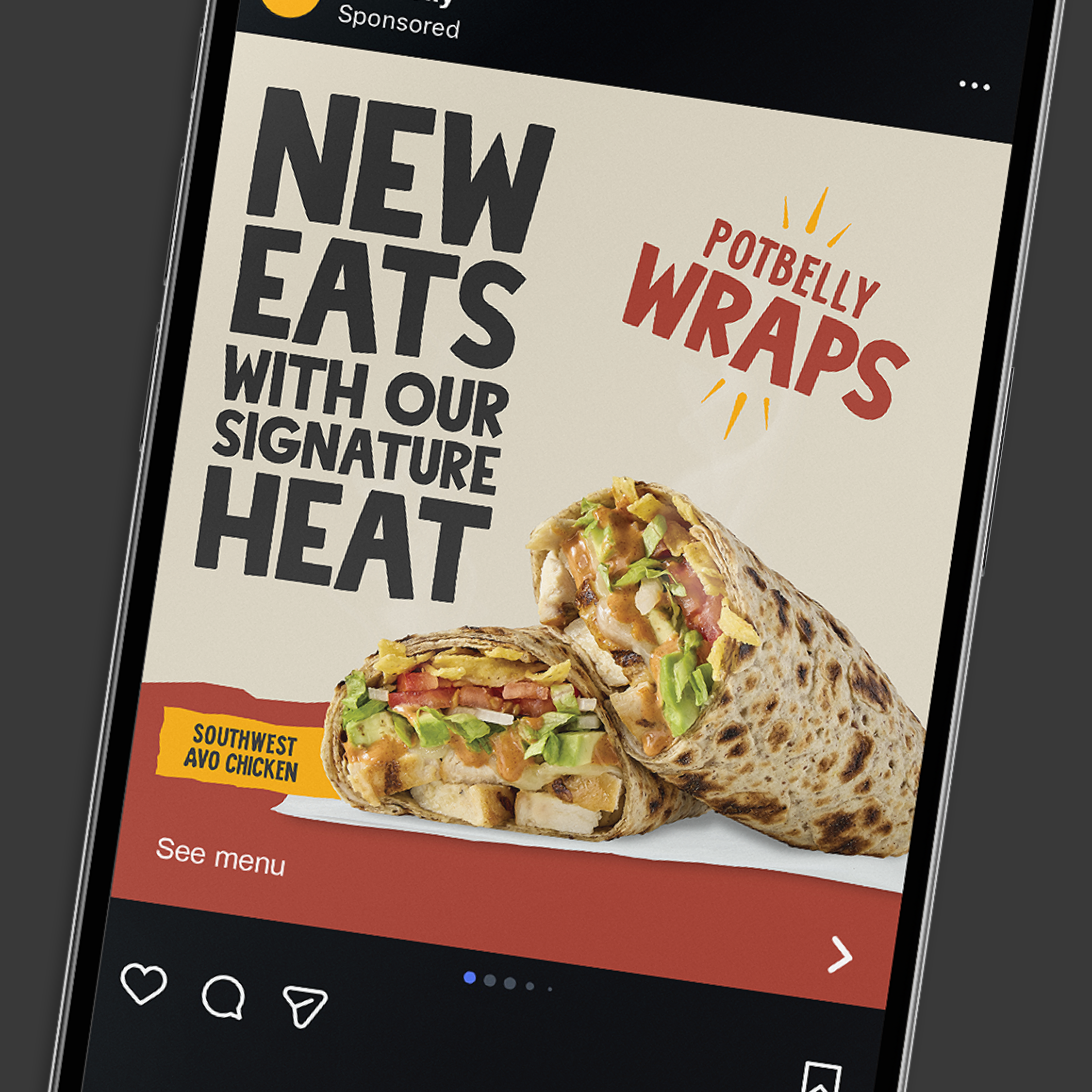
Potbelly was ready to turn a new leaf and test out a menu offering: a series of four flavors wrapped up in lavash flatbread. The missing ingredient? A go-to-market campaign that matches Potbelly’s loud, maximalist brand while introducing a lighter, carb-conscious lunch option.
Piping hot ideas, fresh outta the oven.
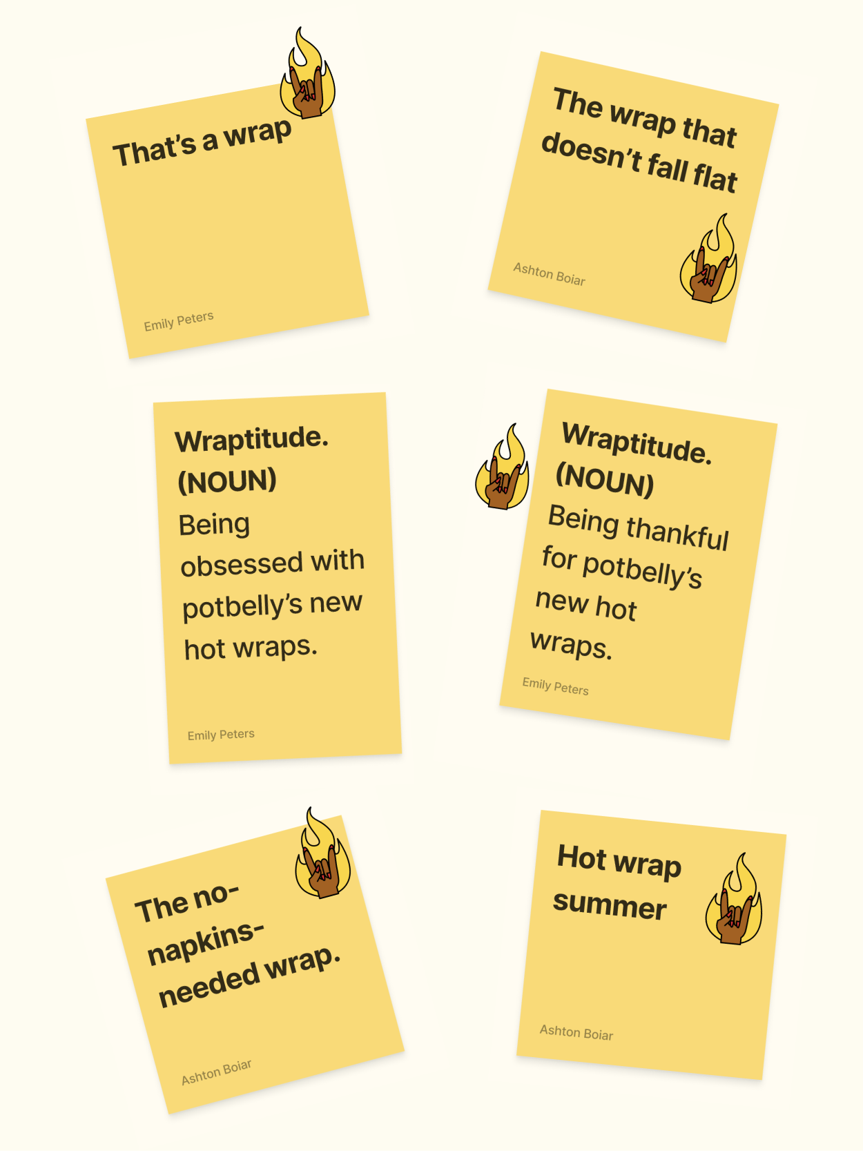
The WCG creative team started cooking on some messaging territories and headlines to follow. After a collaborative presentation with the client, we explored different visual ways in. We built out four distinct design directions—from a rolling typographic treatment to an abstracted peek into a brick oven—all while working within and complementing Potbelly’s signature handcrafted, in-your-face brand.

Jazzed by the thought and the work, Potbelly took our insights, concepts, and execution in-house to begin development on their campaigns in select test markets.
Shouts out to Emily Peters for creative direction, and Danielle Probst for design collab. Kudos to Steph Patino and Ashton Boiar on copy.